Cherry Servers color palette delivers a clean, modern look—balancing boldness with clarity to ensure consistency, usability, and technical trust across all mediums.
#Overview
The Cherry Servers color palette is designed to support a clean, modern, and professional visual identity. It balances bold brand expression with functional clarity, ensuring consistency across all digital and print touchpoints. Colors are used purposefully to guide attention, support usability, and reinforce the brand’s technical reliability.
#Advertisement
The Cherry Servers color palette is designed to support a clean, modern, and professional visual identity. It balances bold brand expression with functional clarity, ensuring consistency across all digital and print touchpoints. Colors are used purposefully to guide attention, support usability, and reinforce the brand’s technical reliability.

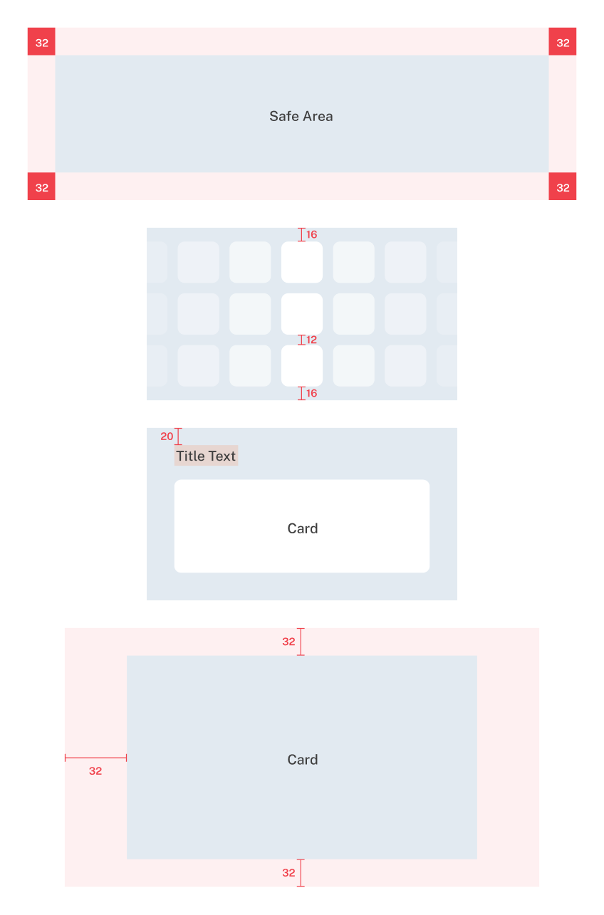
#Safe area - shapes